luxury skincare & fragrance rebrand
BRANDING · PRODUCT DESIGN
Project Overview
Jayla is a luxury beauty brand based in Saudi Arabia, stocked in leading department stores including Selfridges and shipping worldwide.
As the product range expanded across skincare, fragrance, and lifestyle, the brand required a more elevated and cohesive identity that could scale across global markets. The project ultimately became a complete visual evolution across the product line.
Brief
The initial goal was to refresh the existing brand while maintaining recognisability. As the process developed, it became clear that a full rebrand was needed to define Jayla’s long-term identity within the luxury beauty space.
Role & Approach
Across several design rounds, I translated feedback and visual references into structured design systems, refining the direction until a clear identity emerged.
Once the brand vision aligned, I developed a scalable packaging system that works across a diverse product range while maintaining a strong, recognisable aesthetic.
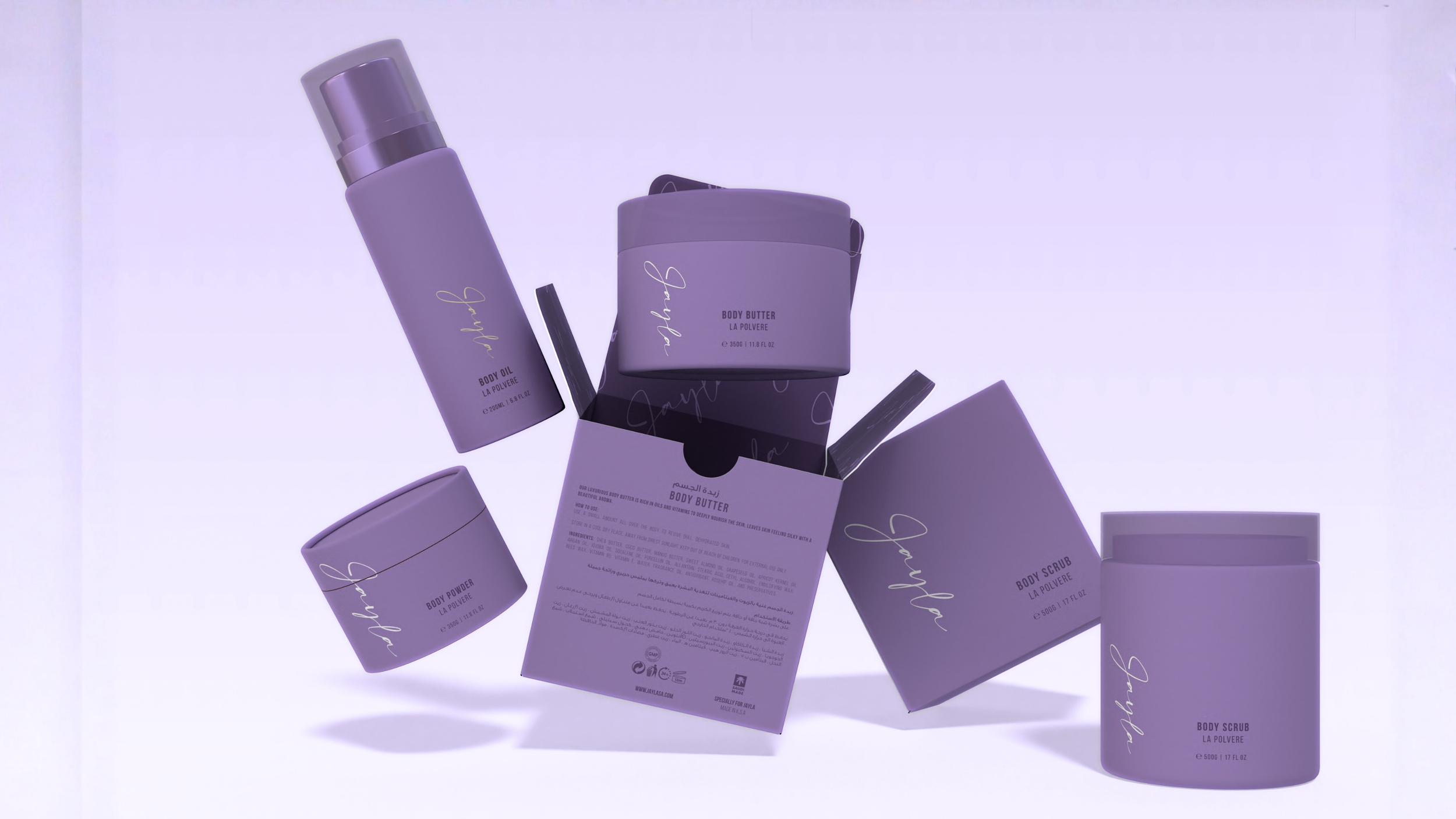
early design explorations
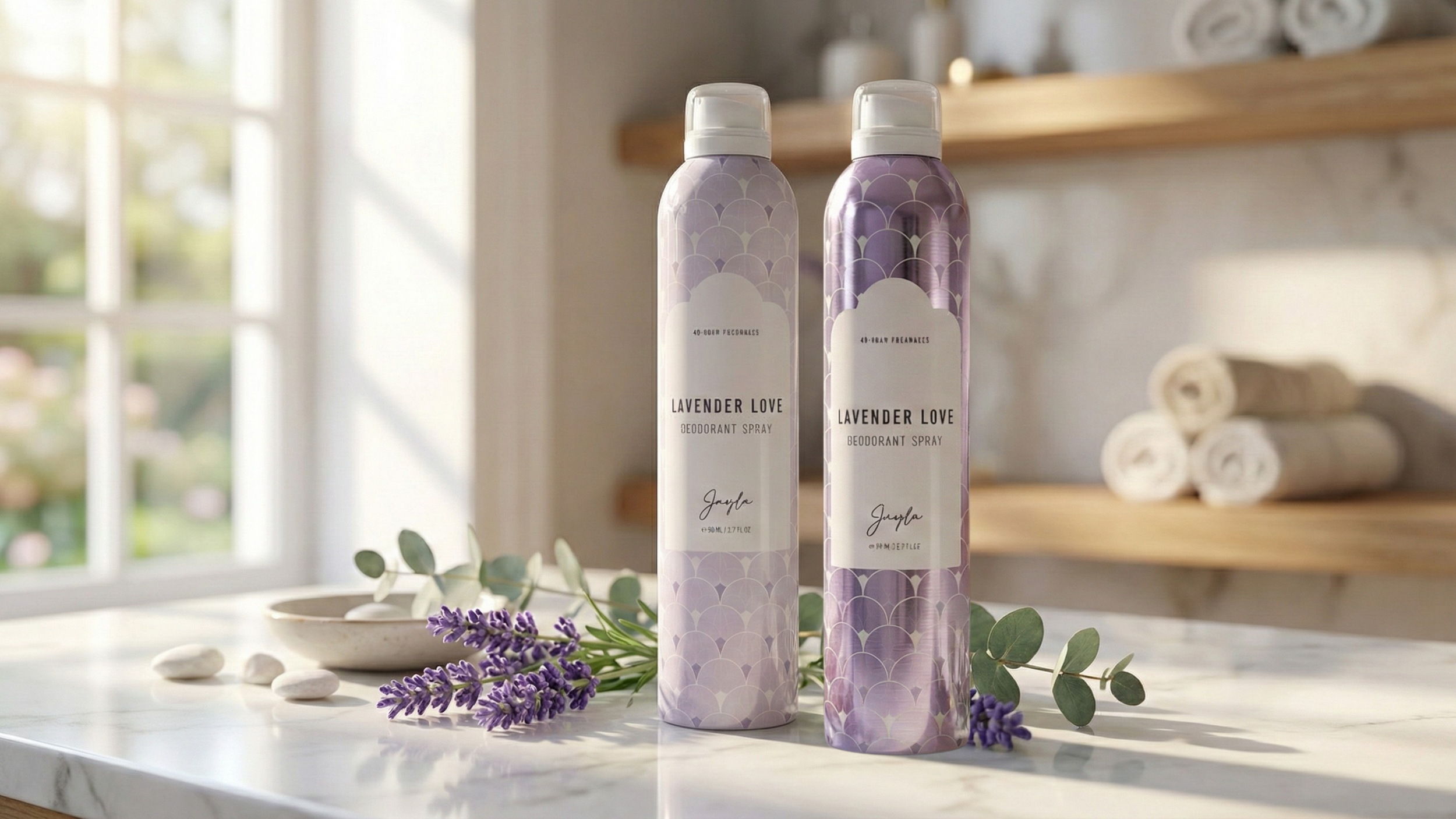
Across the initial design phases, we explored several directions that stayed close to the existing brand, leaning minimal, clean, and understated.
While these concepts were well received visually, the client felt they didn’t reflect the future of Jayla.
These early explorations helped clarify what the brand was not, creating a stronger foundation for defining what it needed to become.
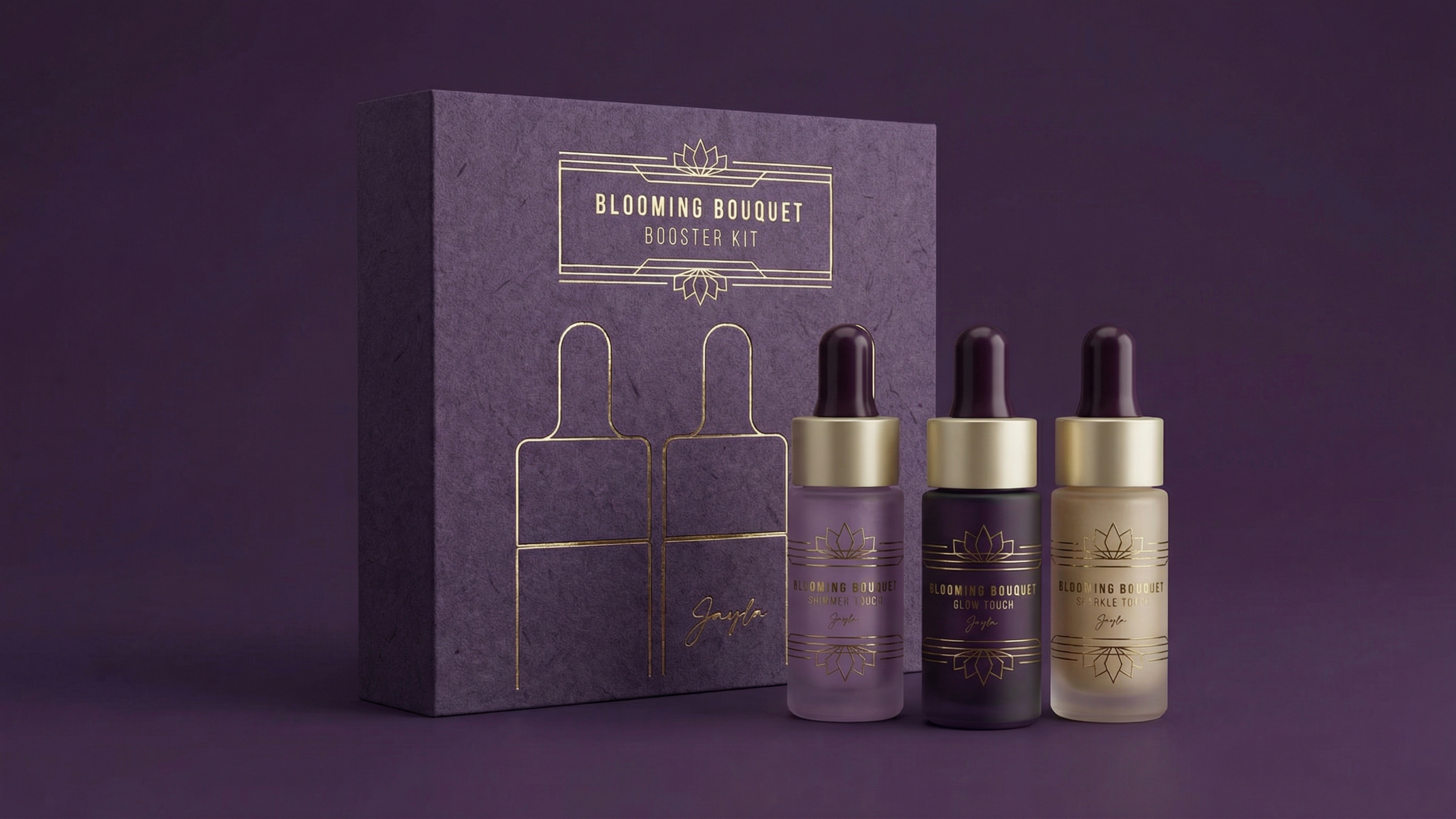
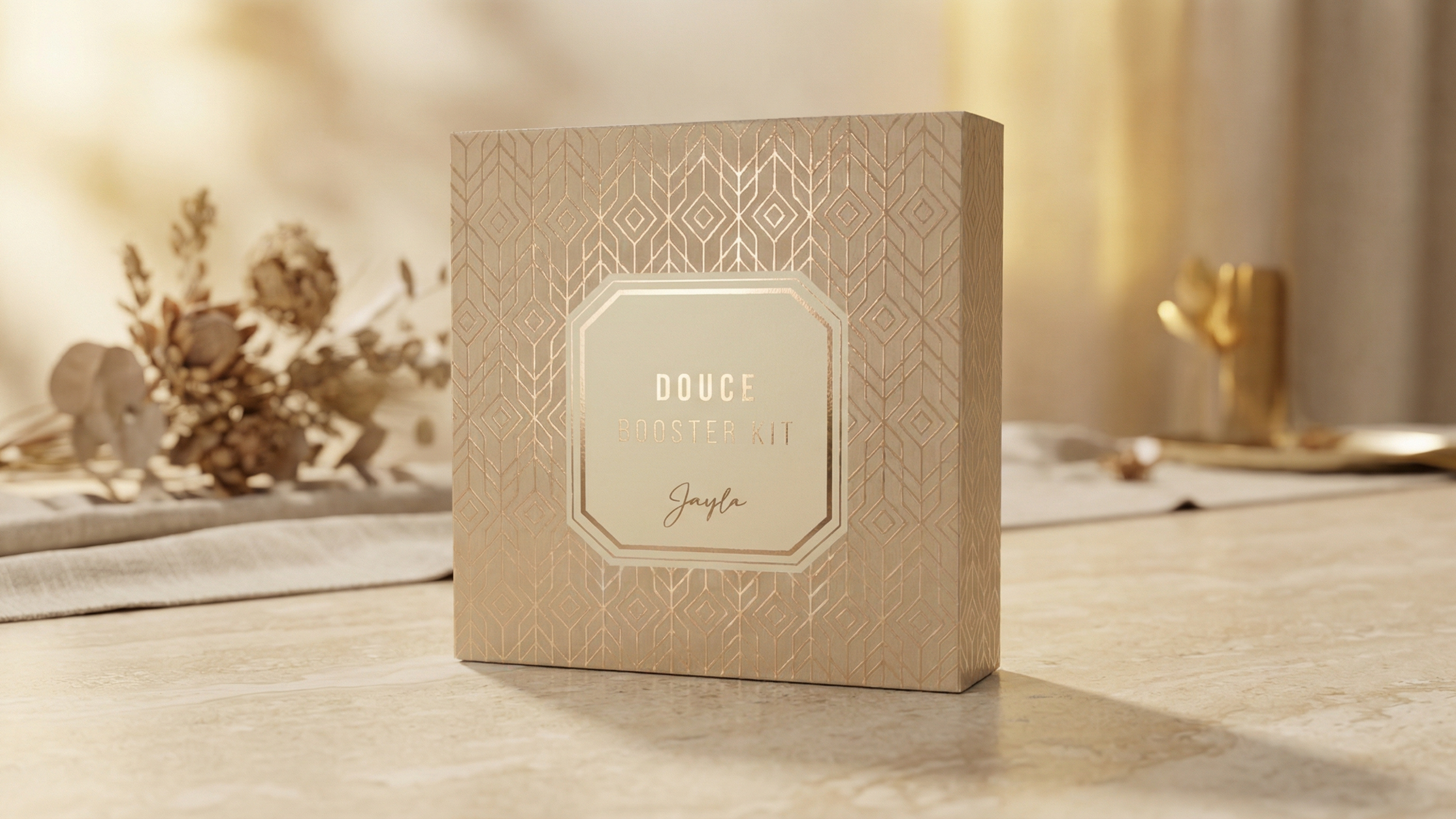
defining the new visual language
Through the exploration process, a clearer direction emerged. Drawing from art-deco influences, the new visual language introduces symmetry, geometry, and decorative detailing, reimagined for a modern luxury beauty brand.
The result balances heritage cues with contemporary clarity, positioning Jayla as a premium, globally relevant brand.
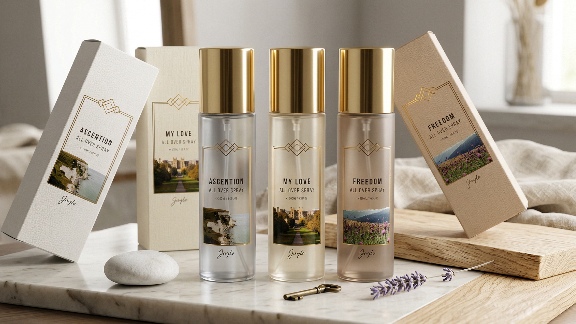
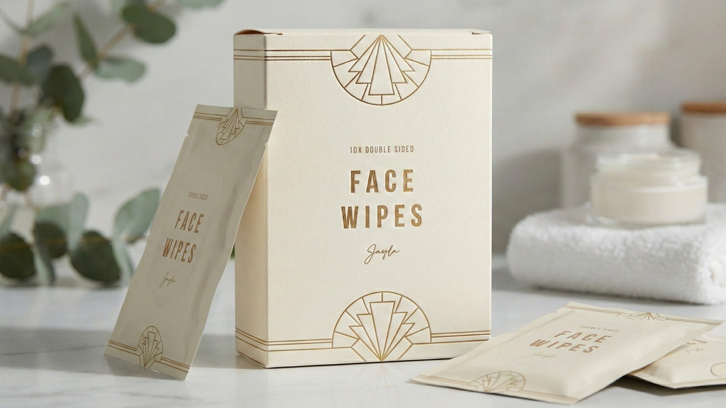
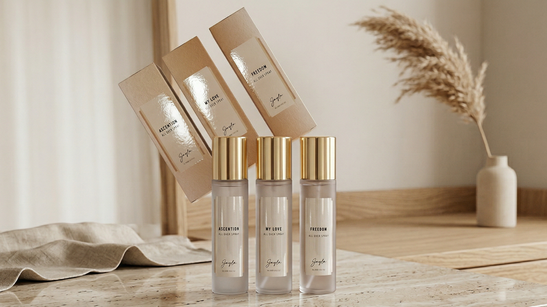
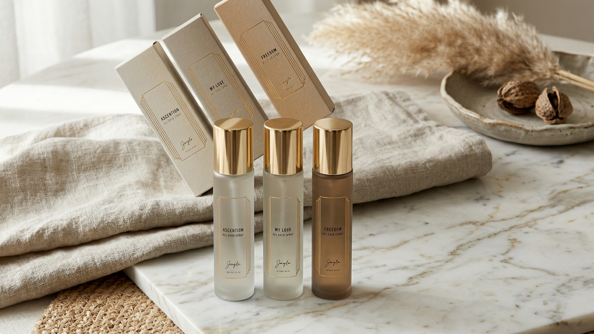
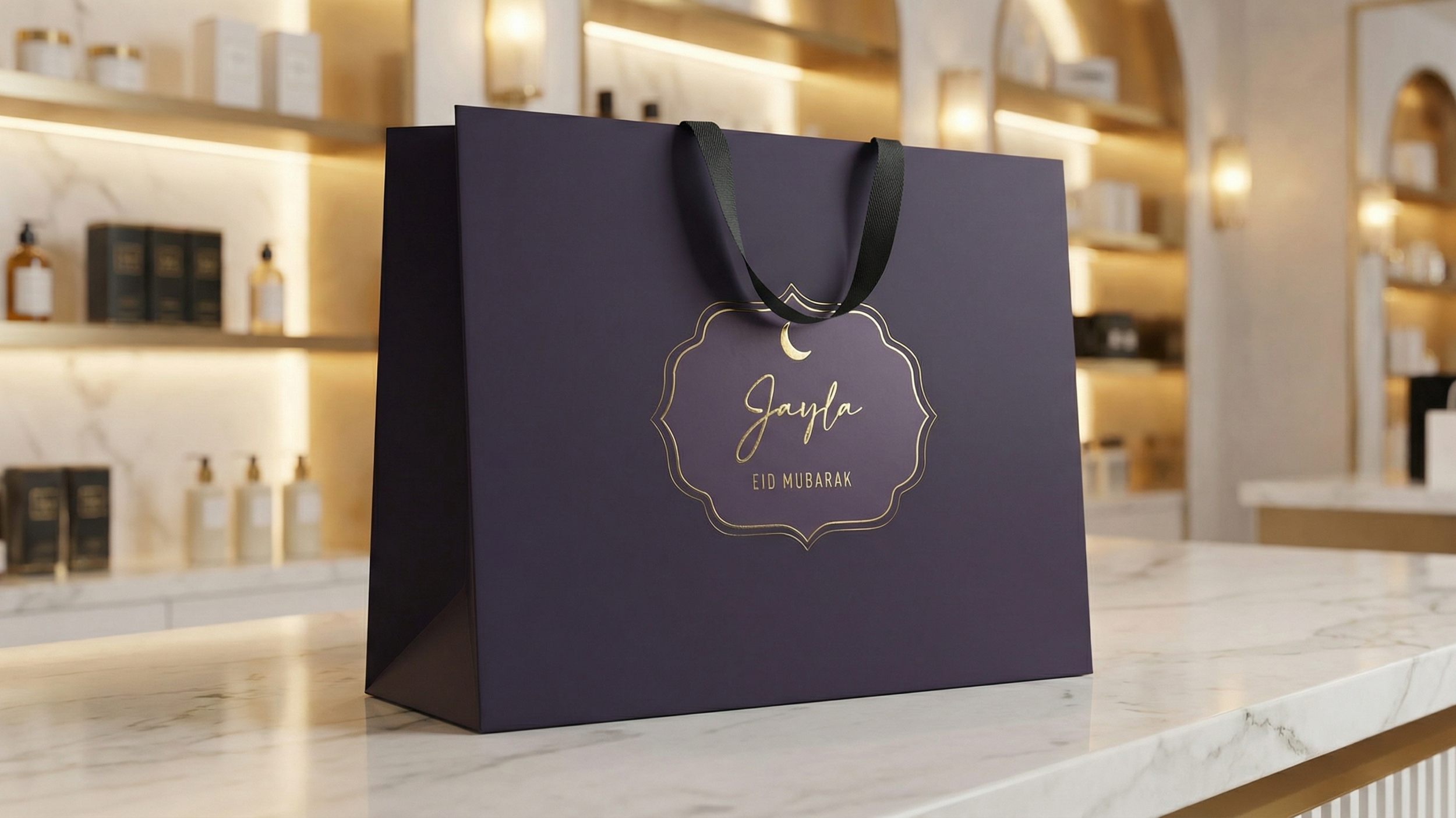
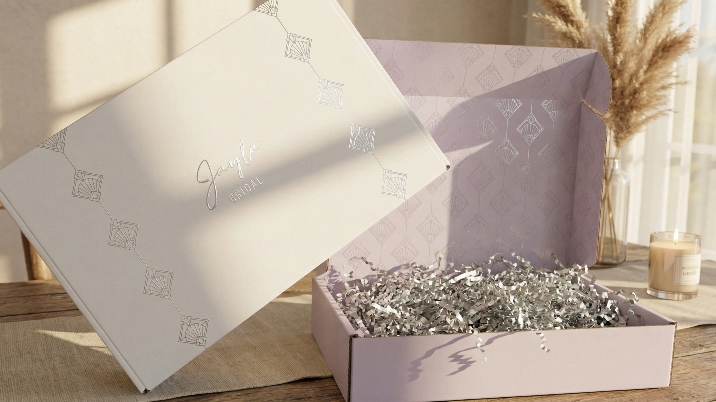
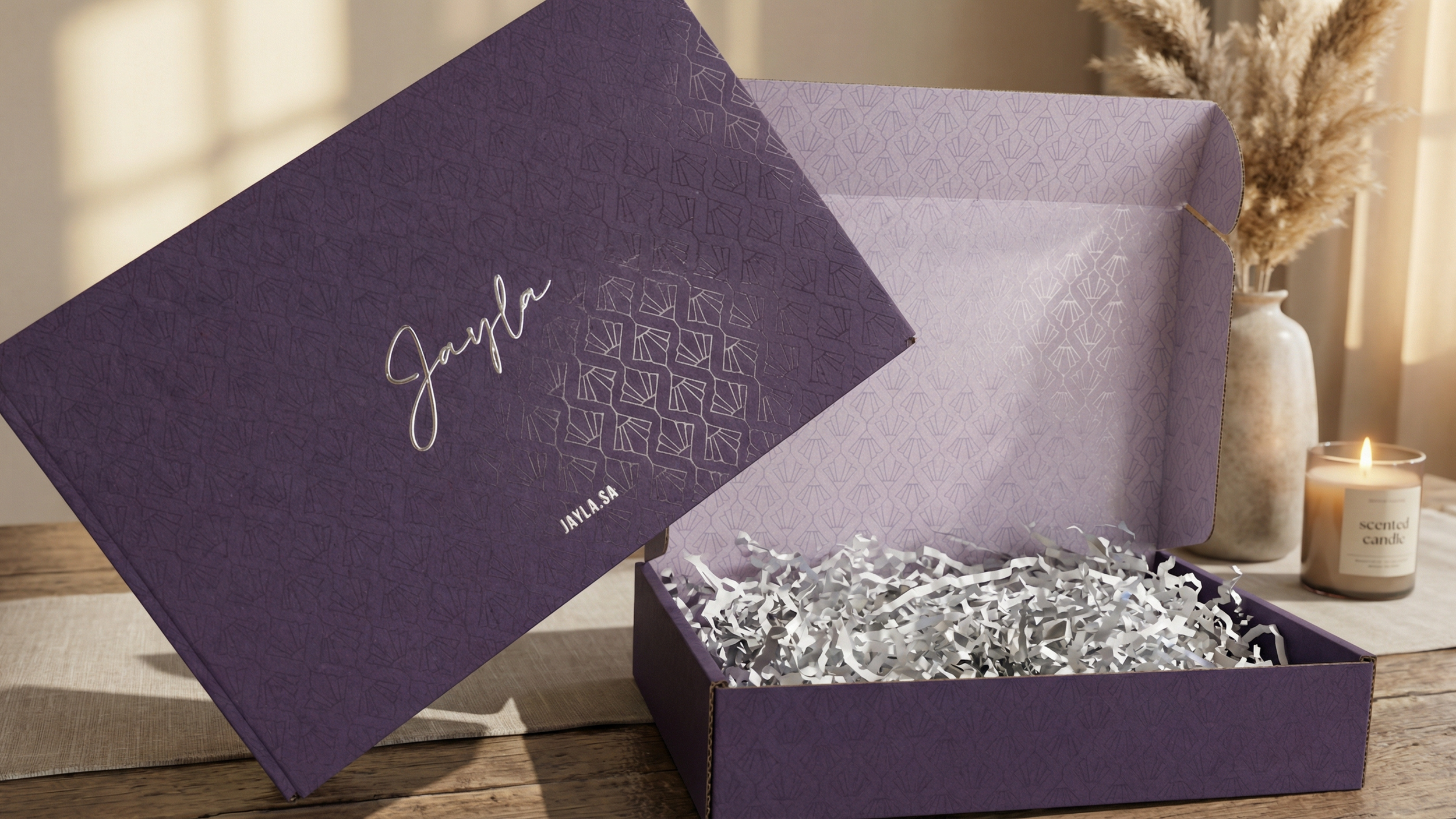
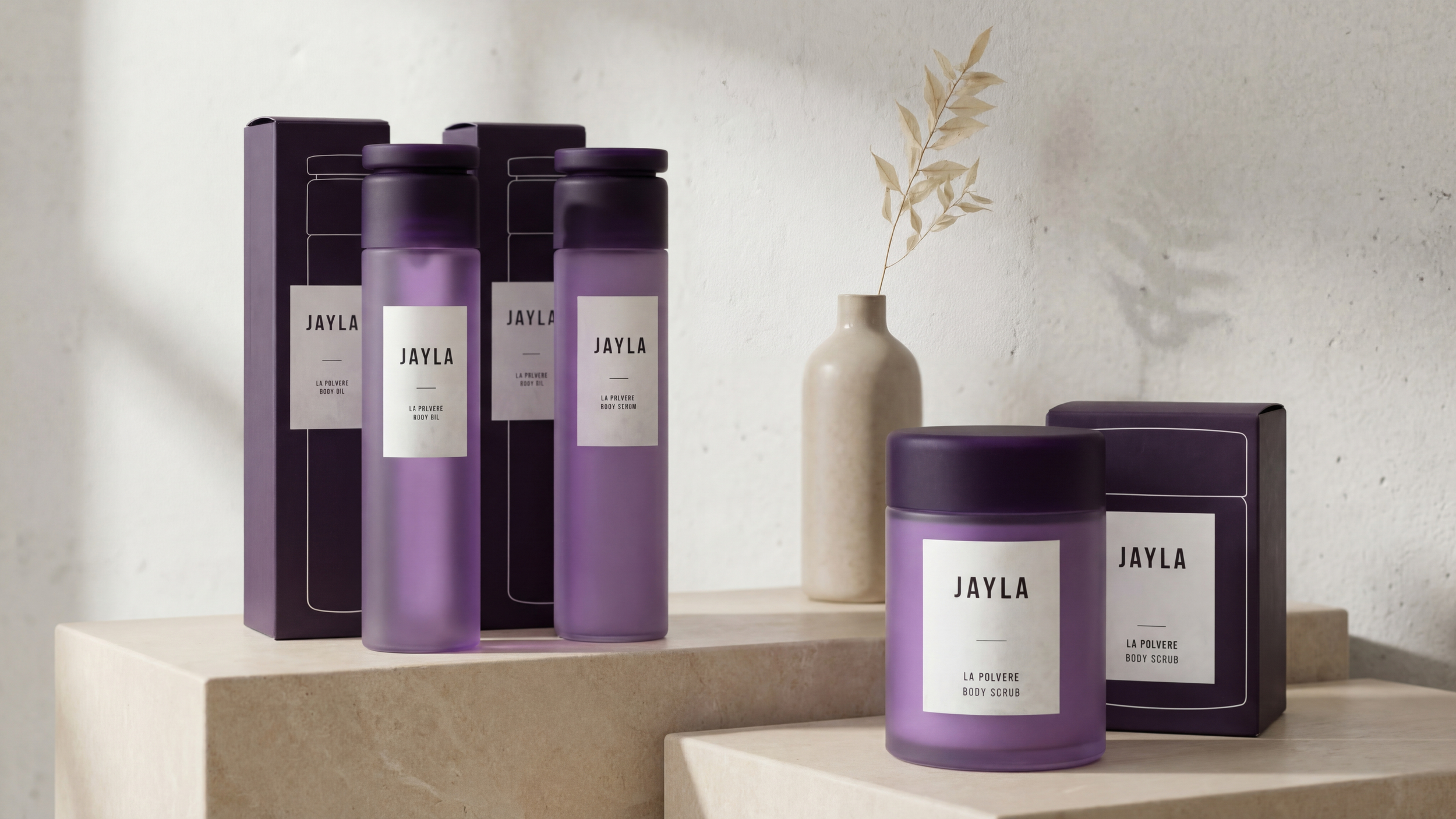
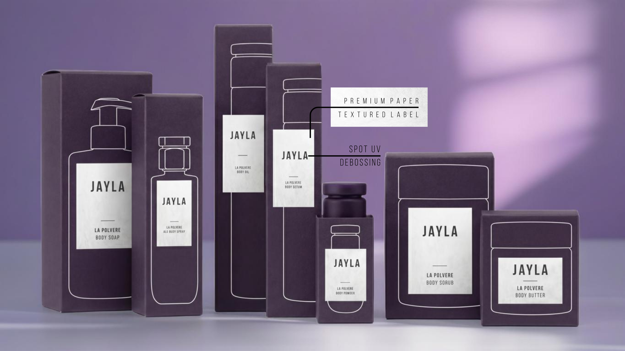
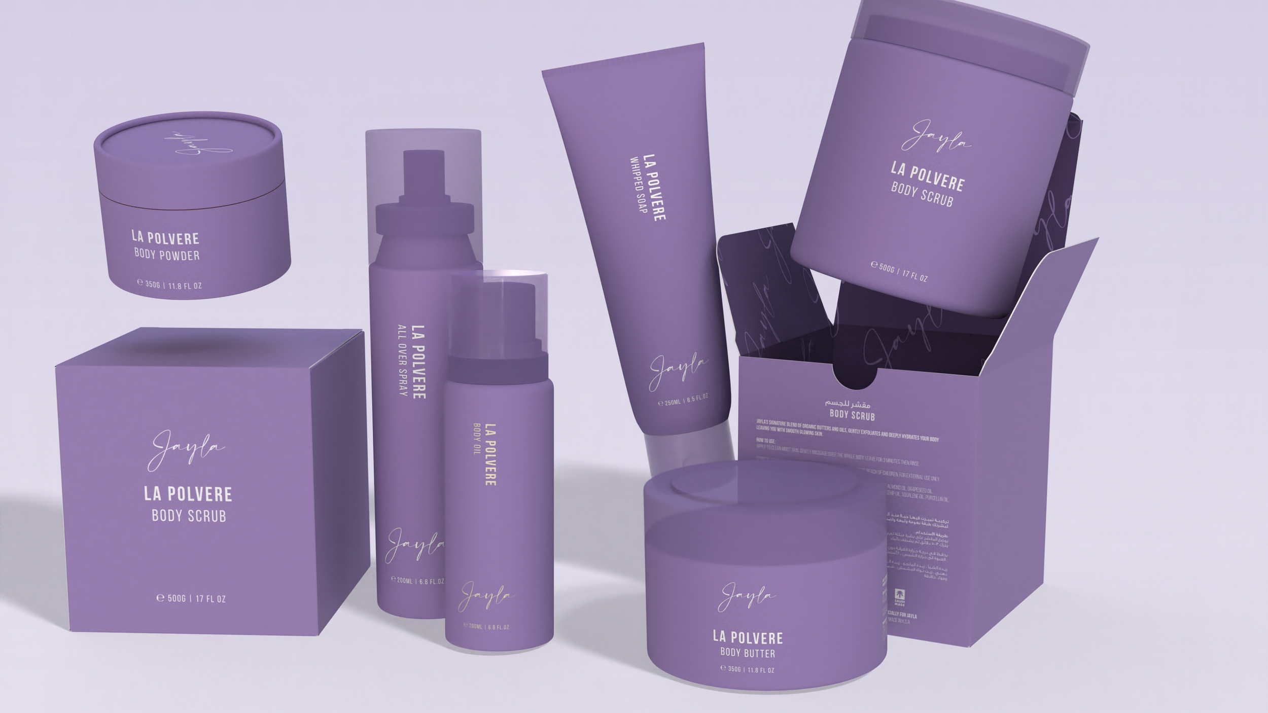
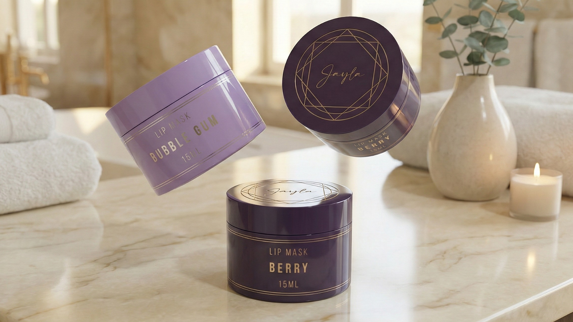
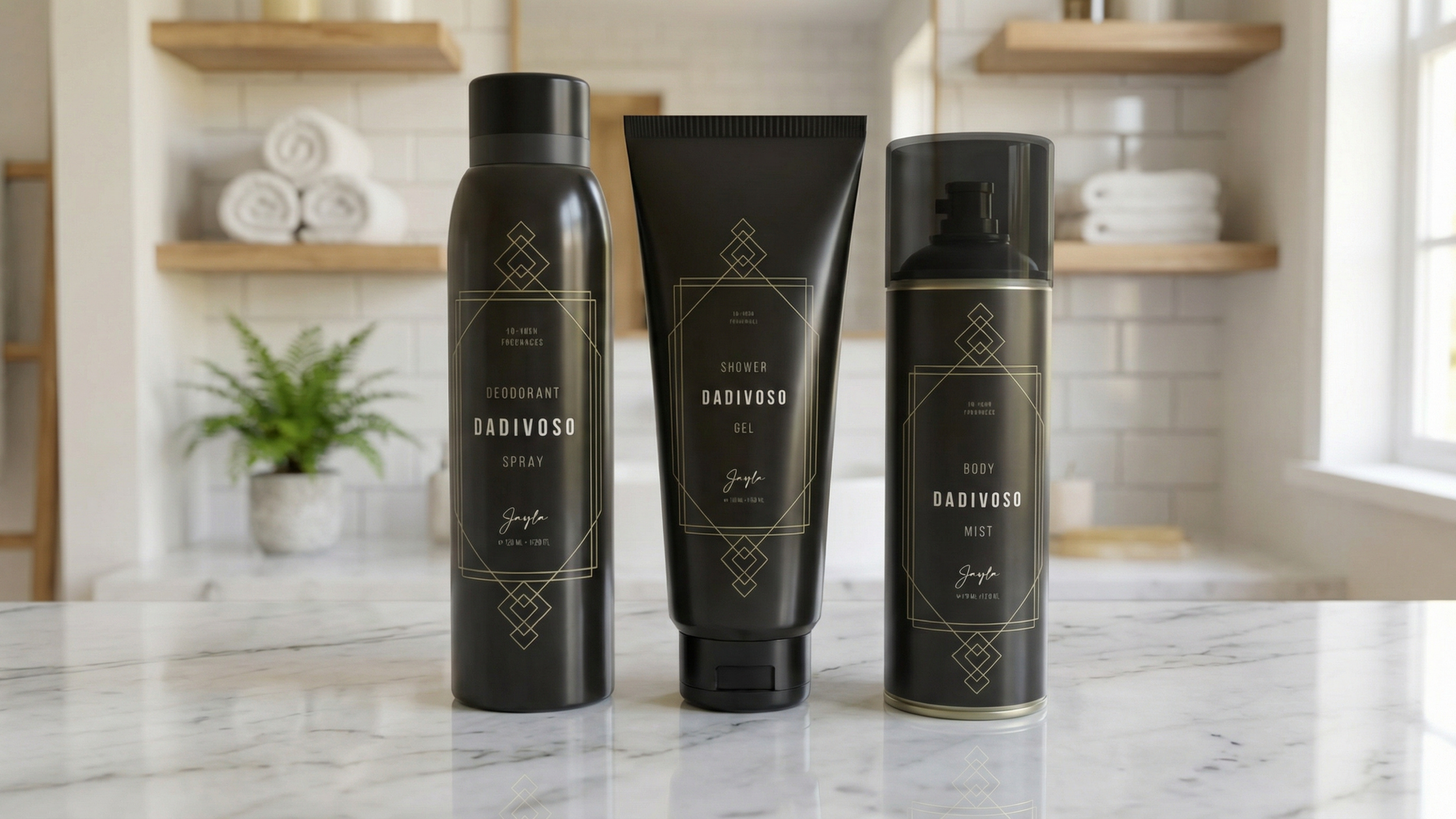
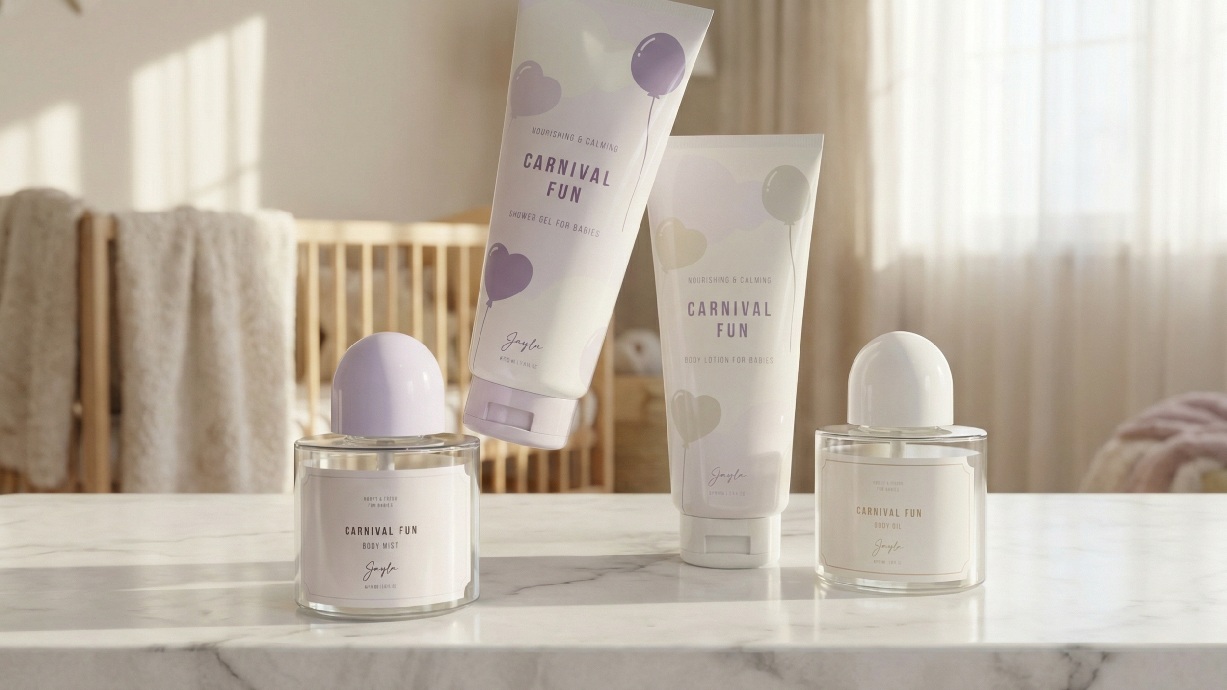
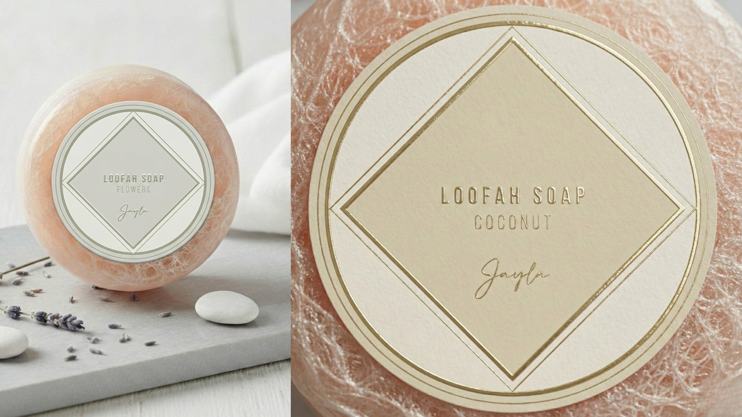
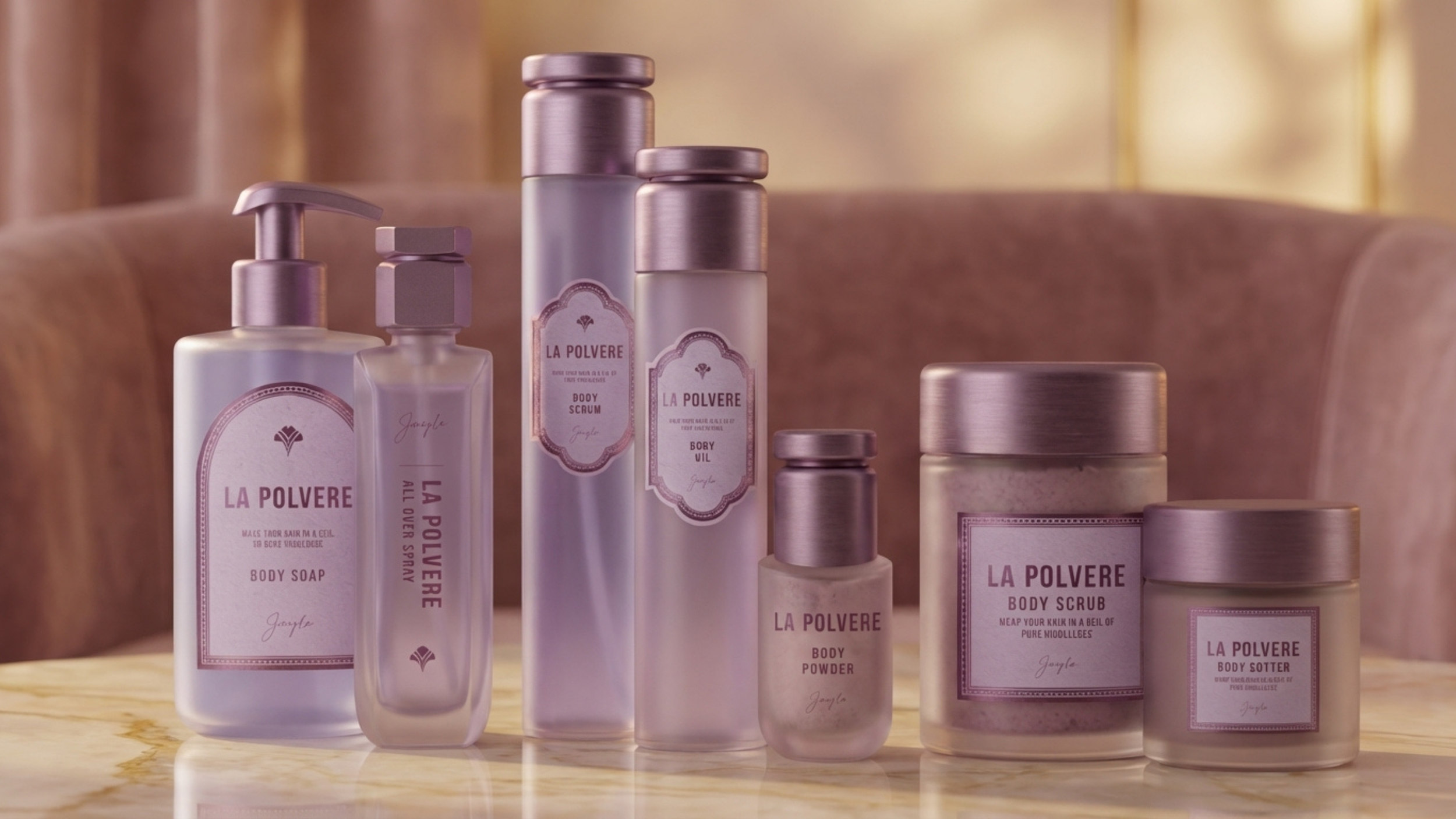
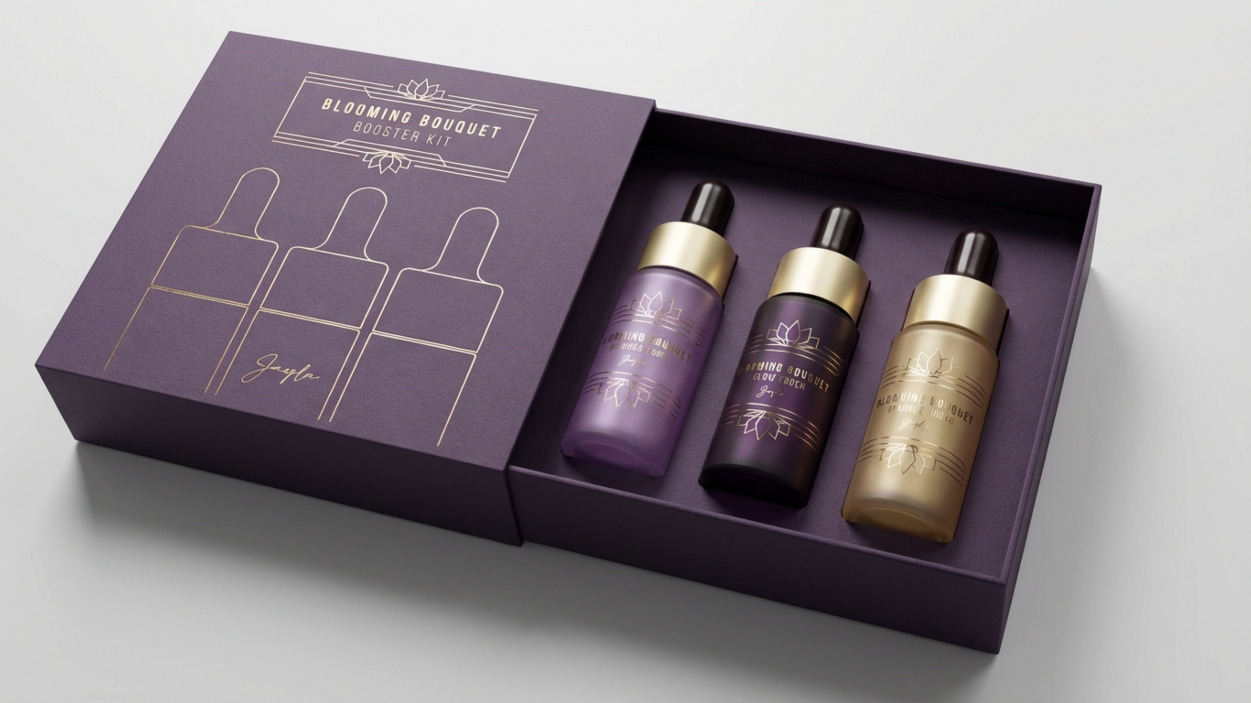
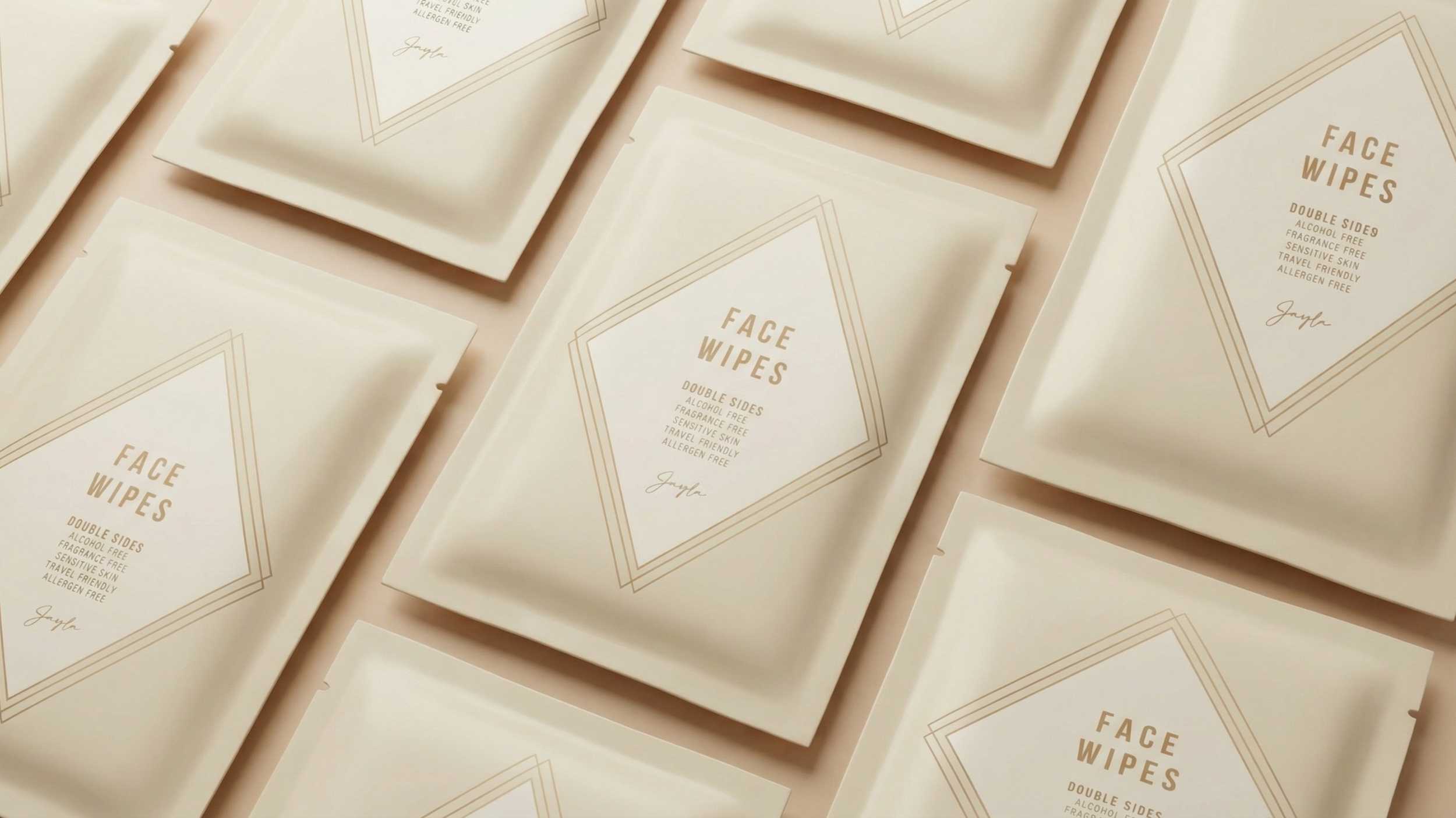
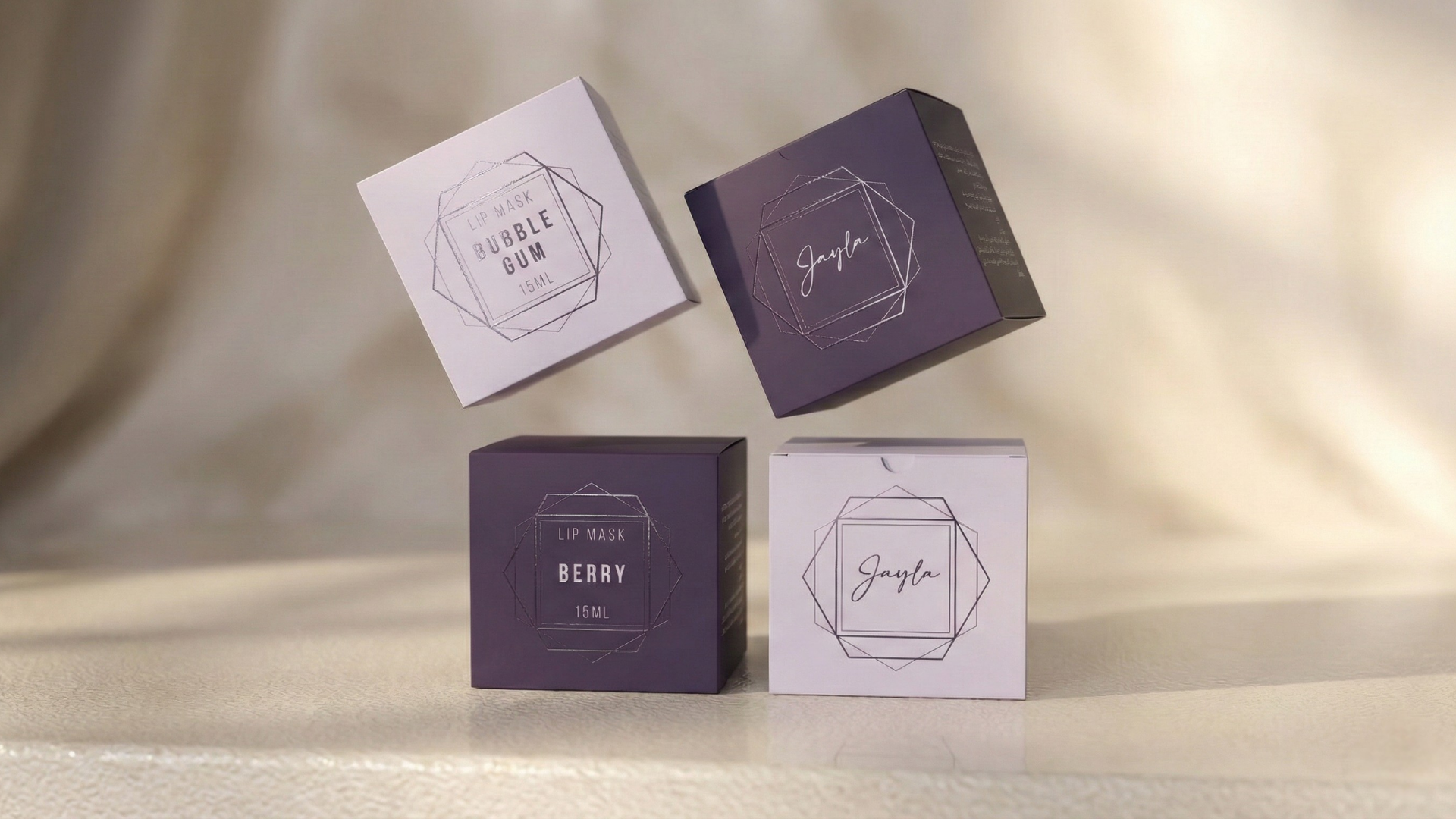
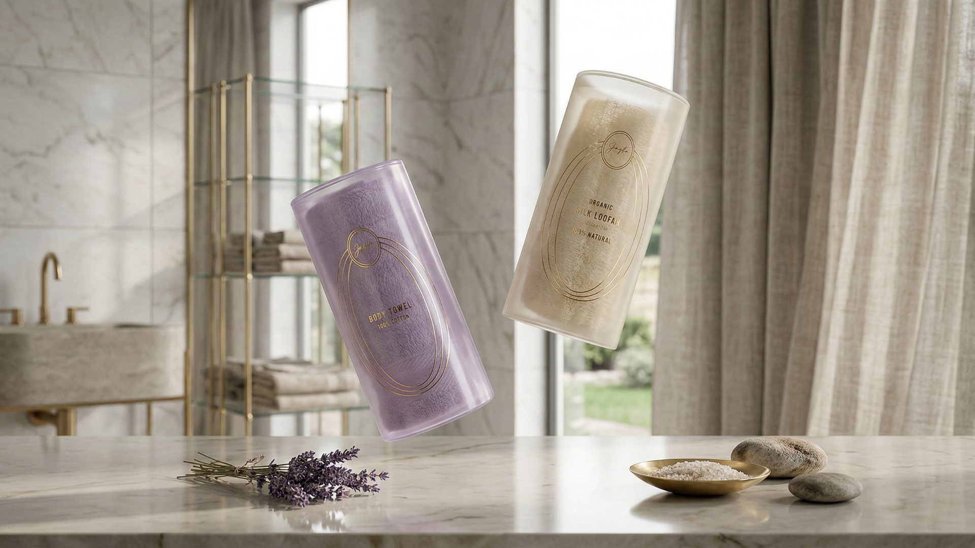
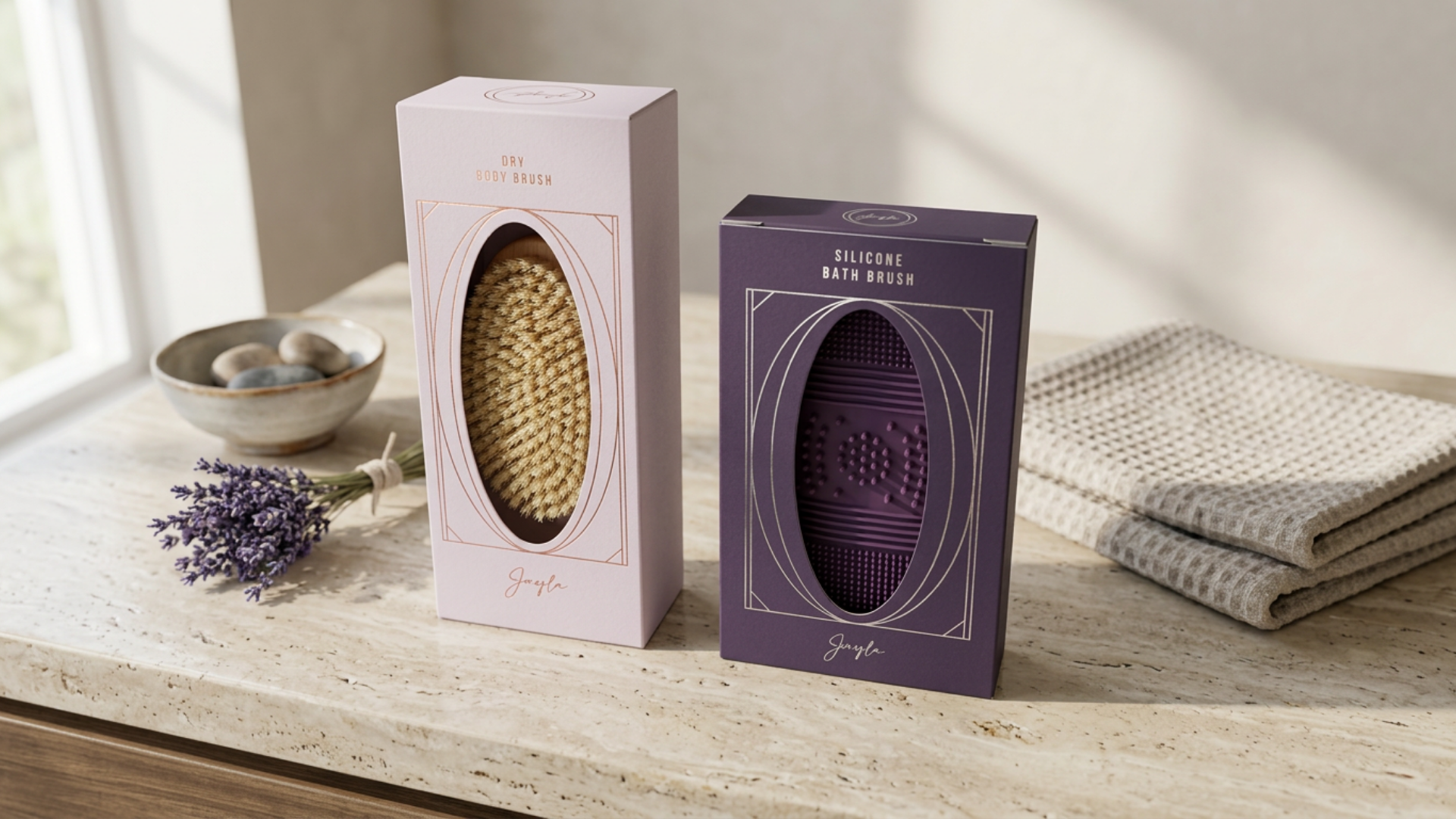
packaging
The final packaging system unifies a wide and growing product range including skincare sets, fragrances, musk, wipes, baby collections, and men’s products under a single, refined identity.
Bold geometry, layered detailing, and elegant symmetry form the foundation of the design, ensuring visual consistency while allowing each product category to retain its own character.

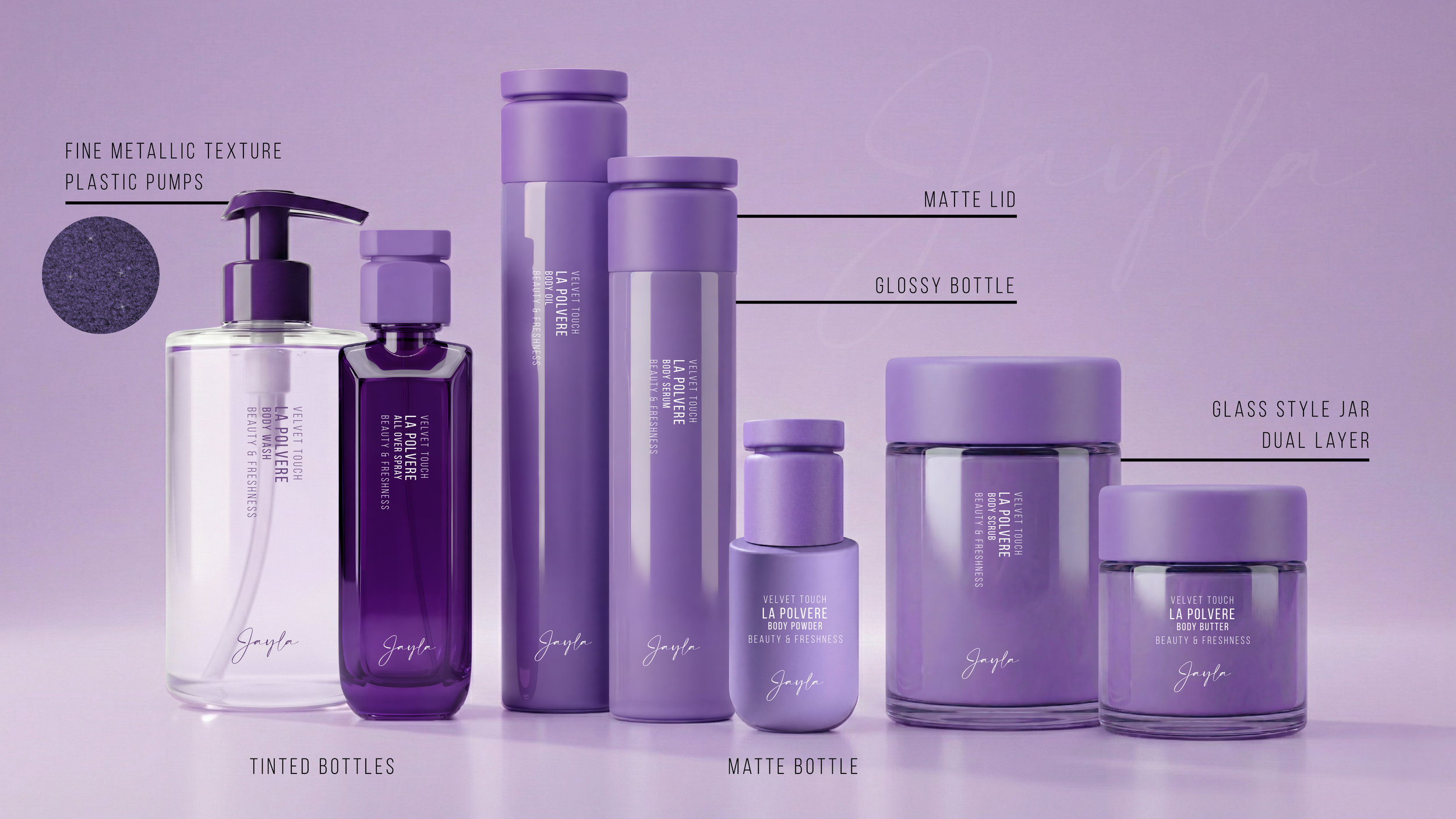
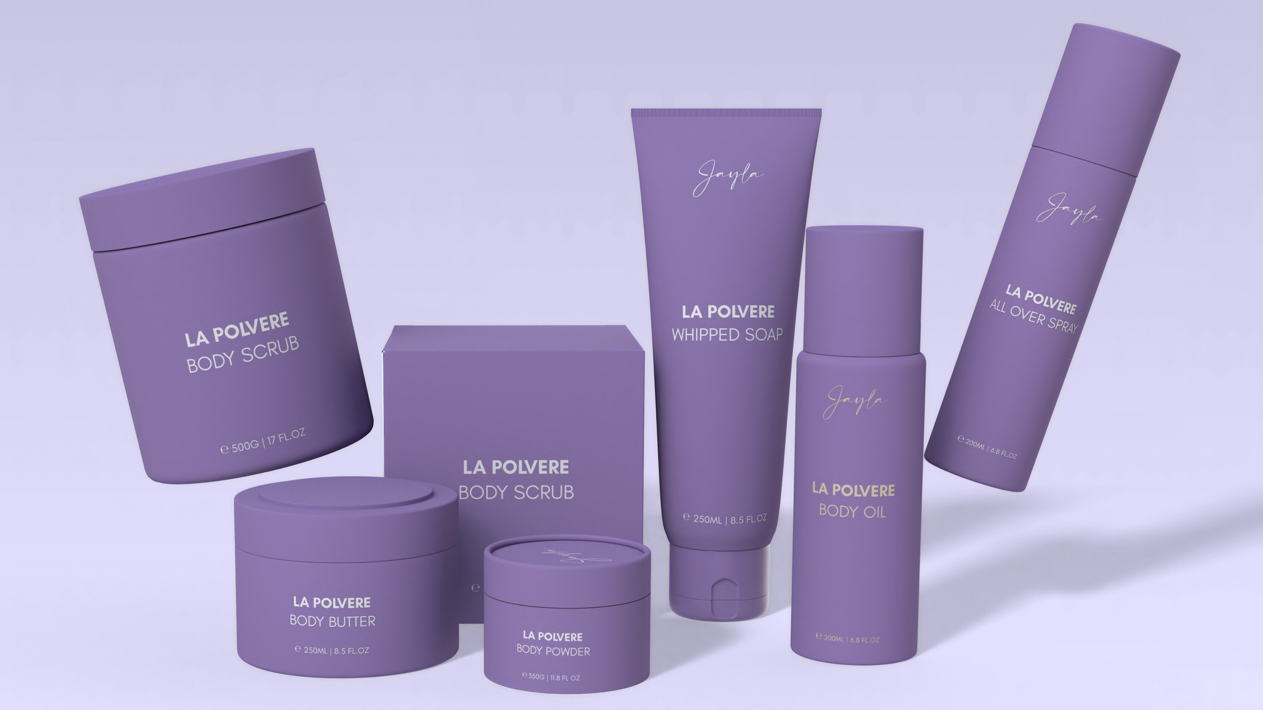
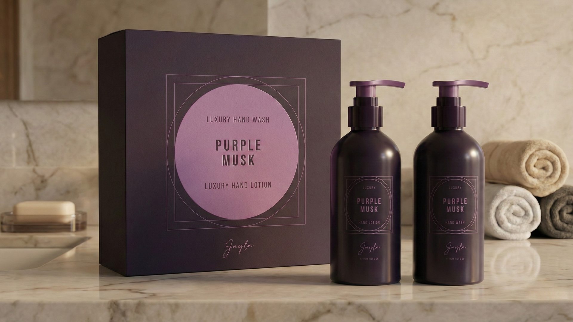
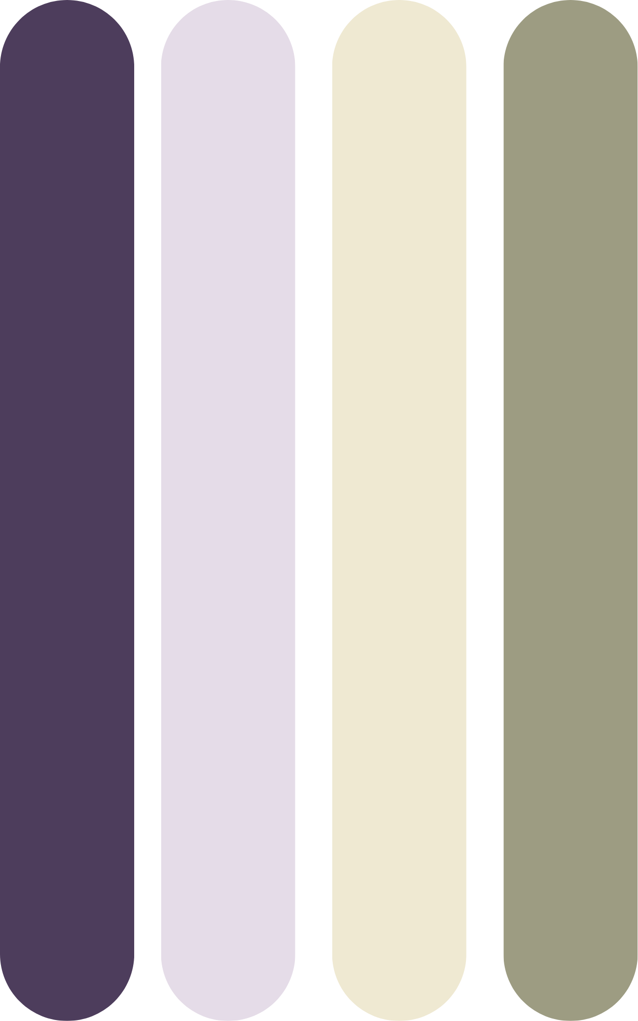
colour palette
The colour palette was updated to feel more mature, luxurious, and timeless. It moves away from lighter tones toward richer, more grounded hues, while still drawing from the natural tones of lavender fields and buds.
To support Jayla’s wide product range, lighter and darker variations of the core palette were introduced. This allows each collection to express its own mood, from softer tones for baby ranges to deeper, more muted shades for men’s and fragrance lines, while remaining visually cohesive across the brand.

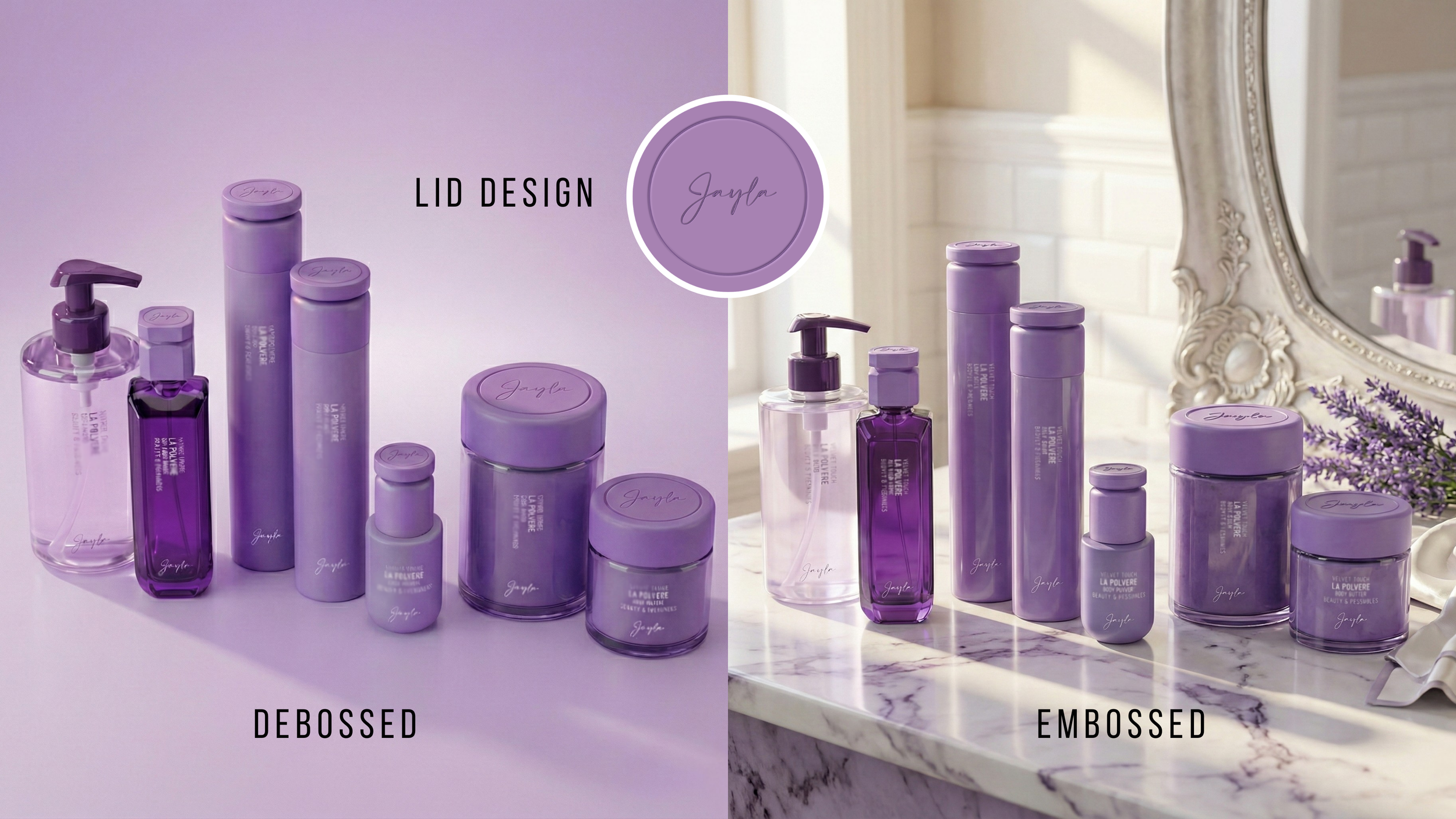
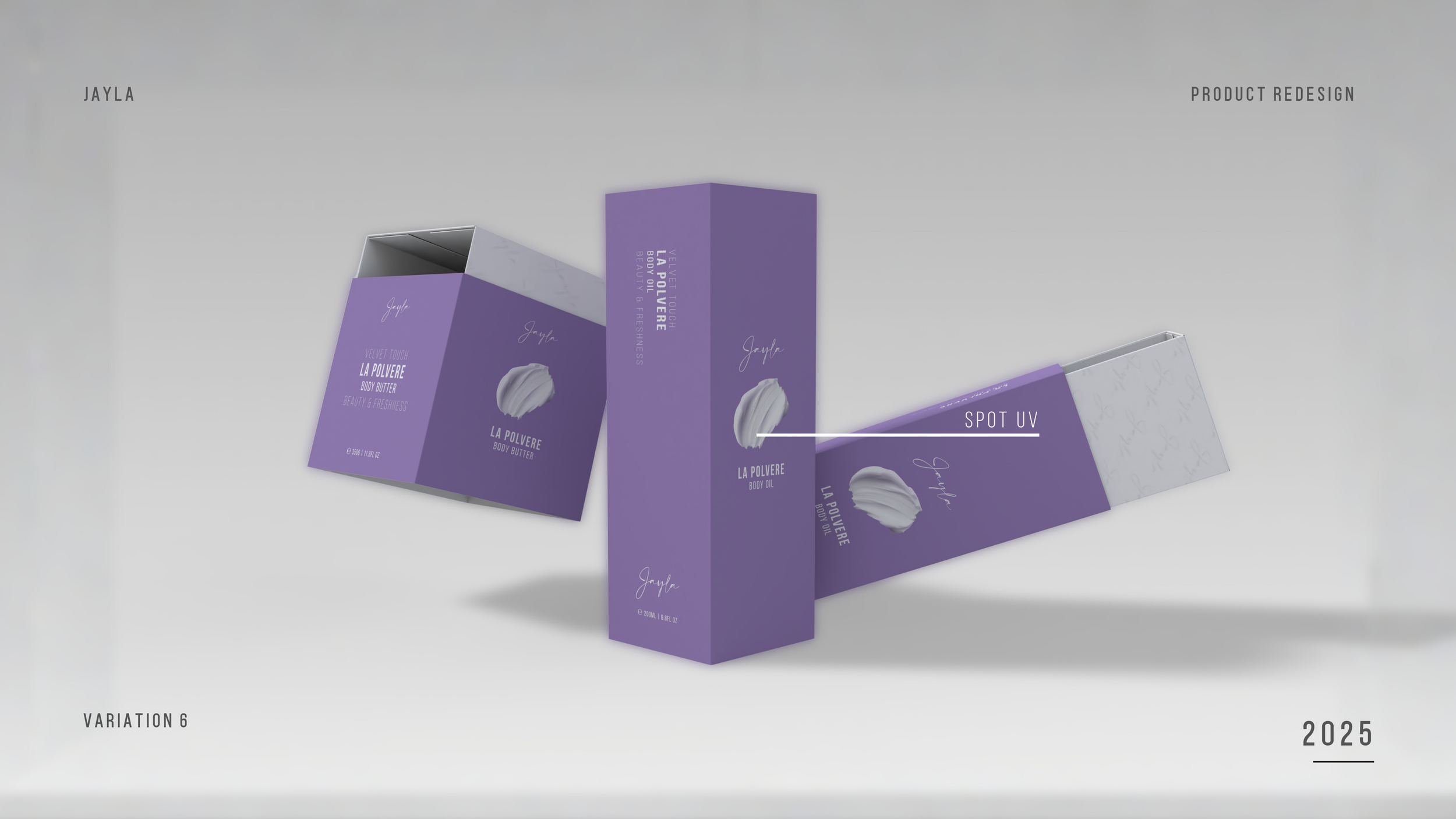
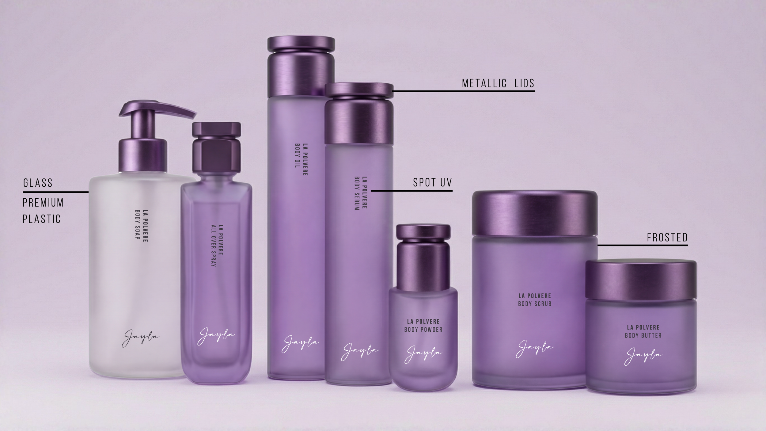
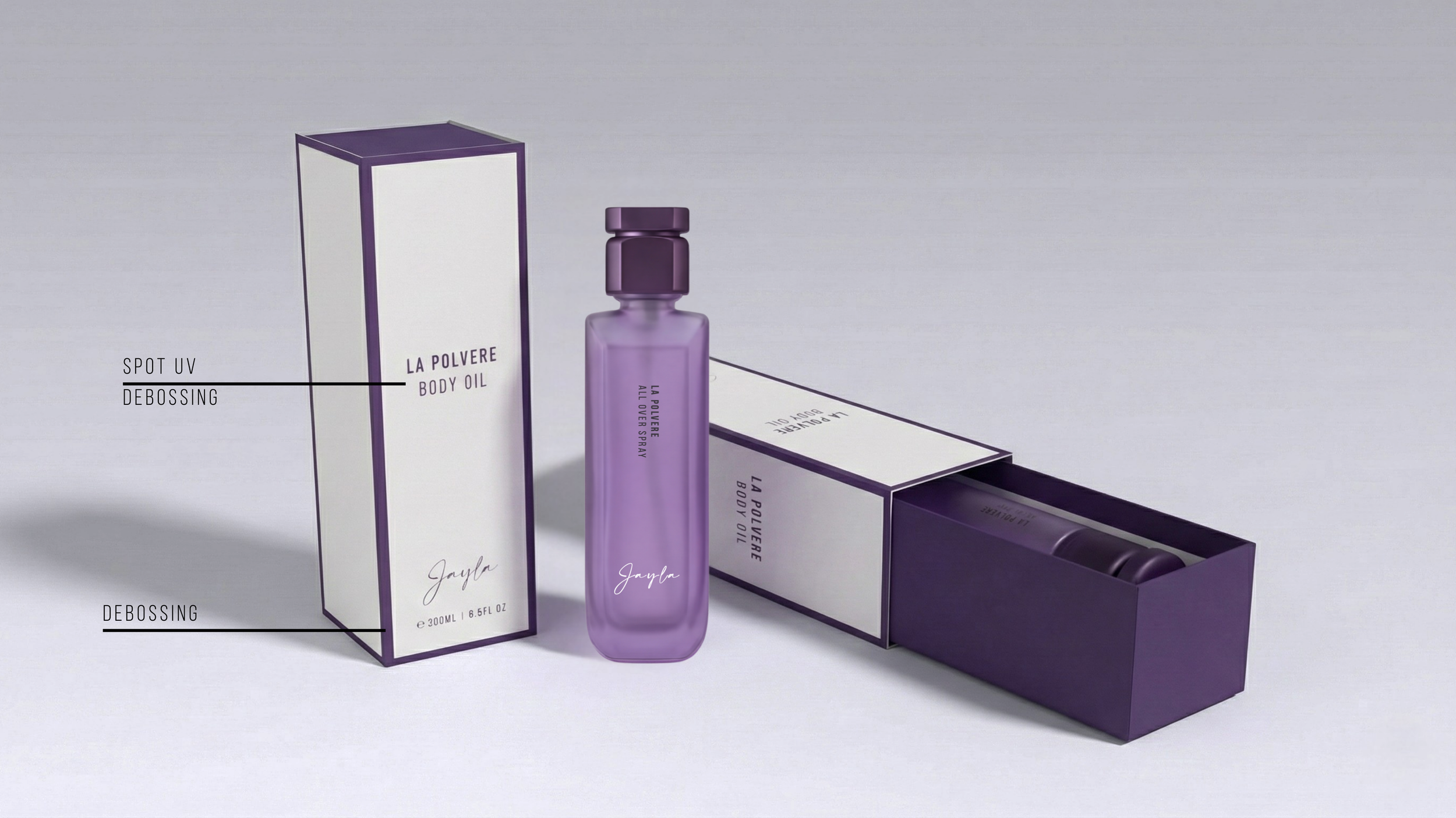
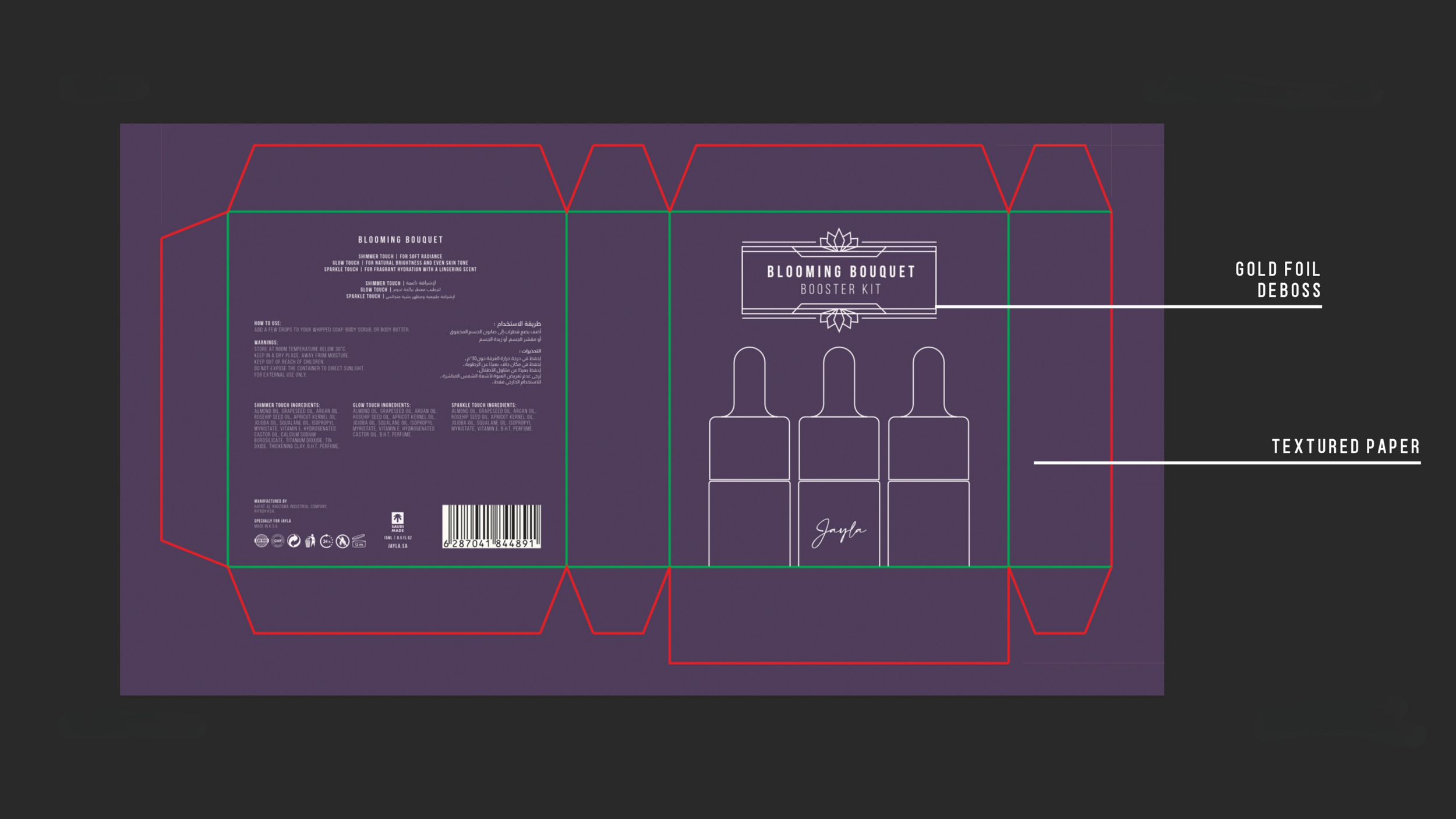
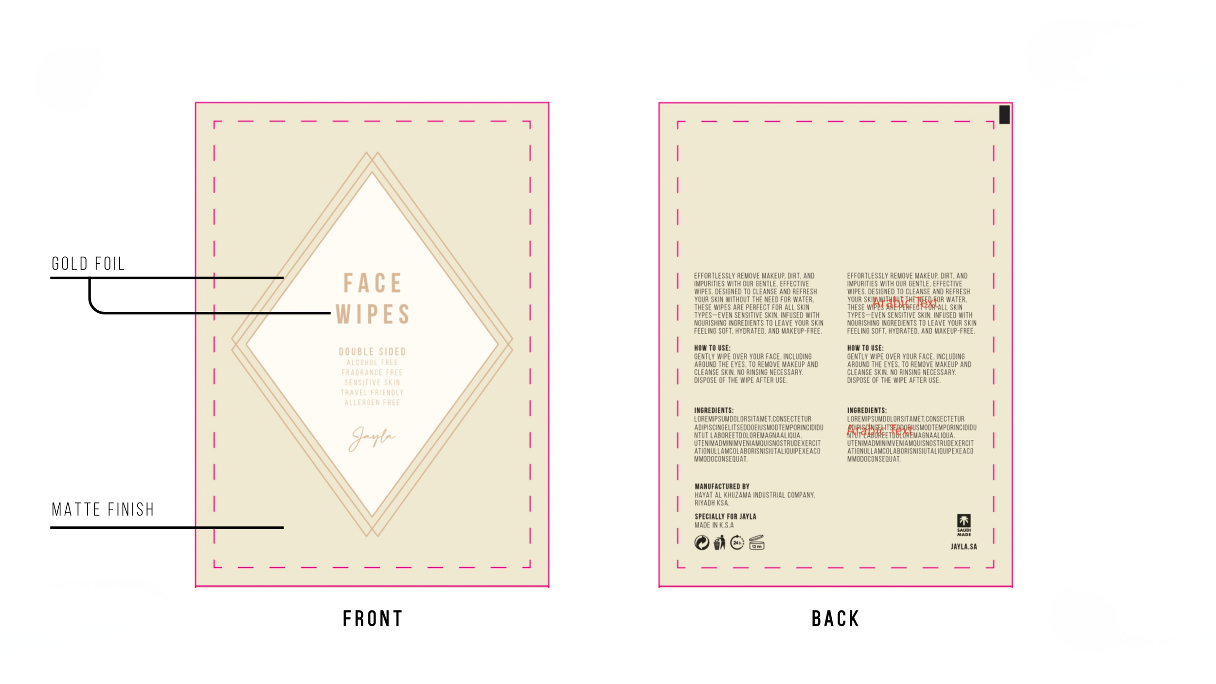
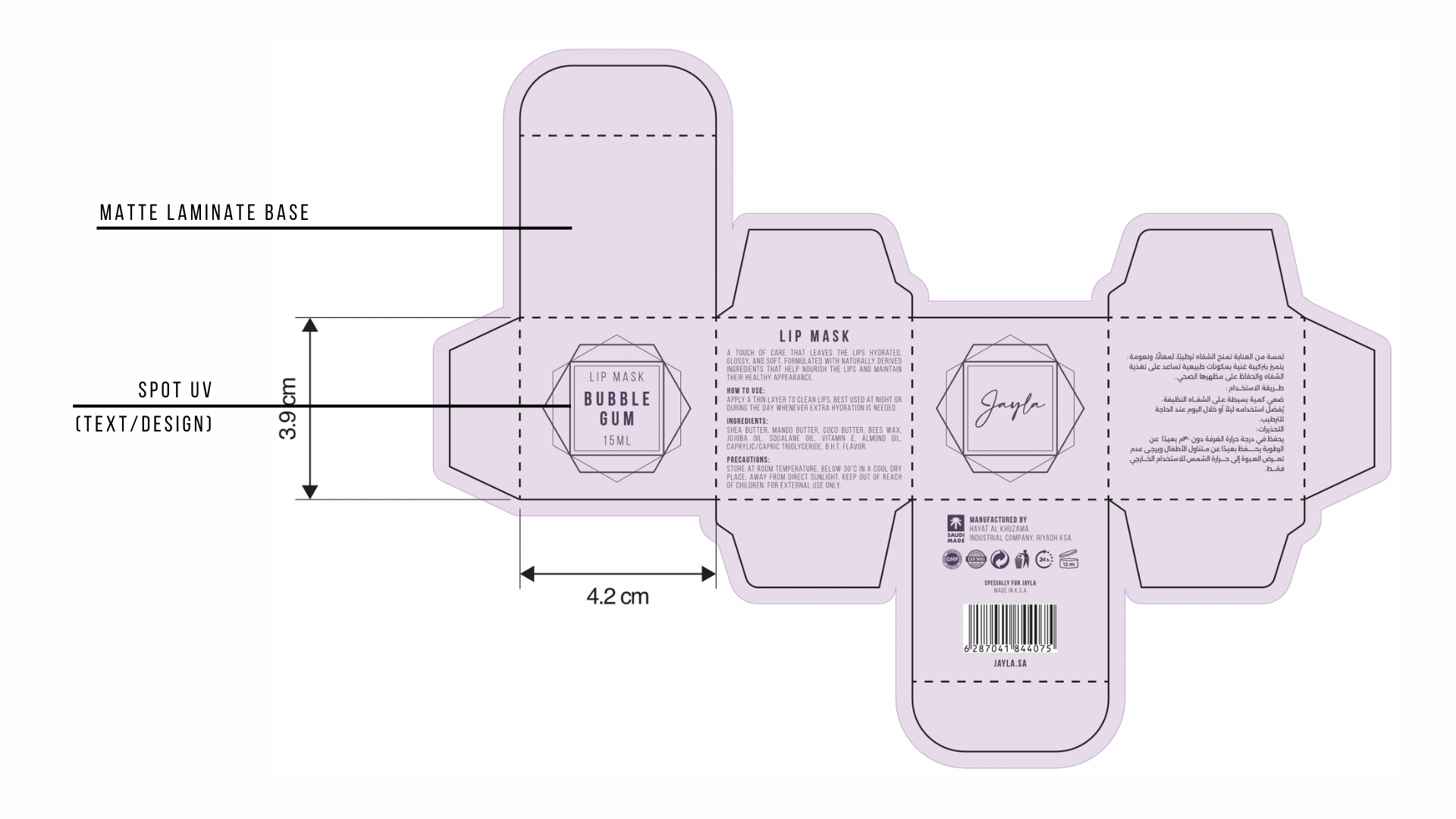
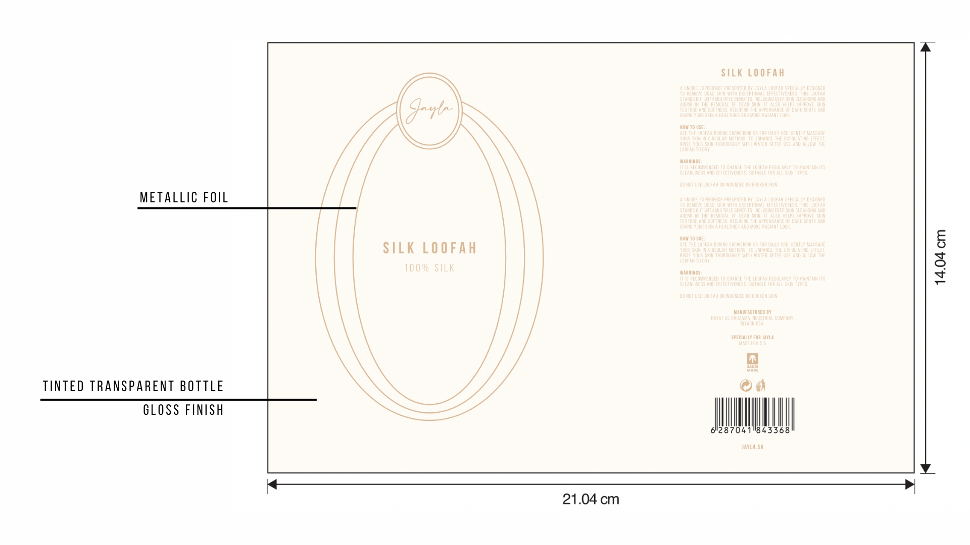
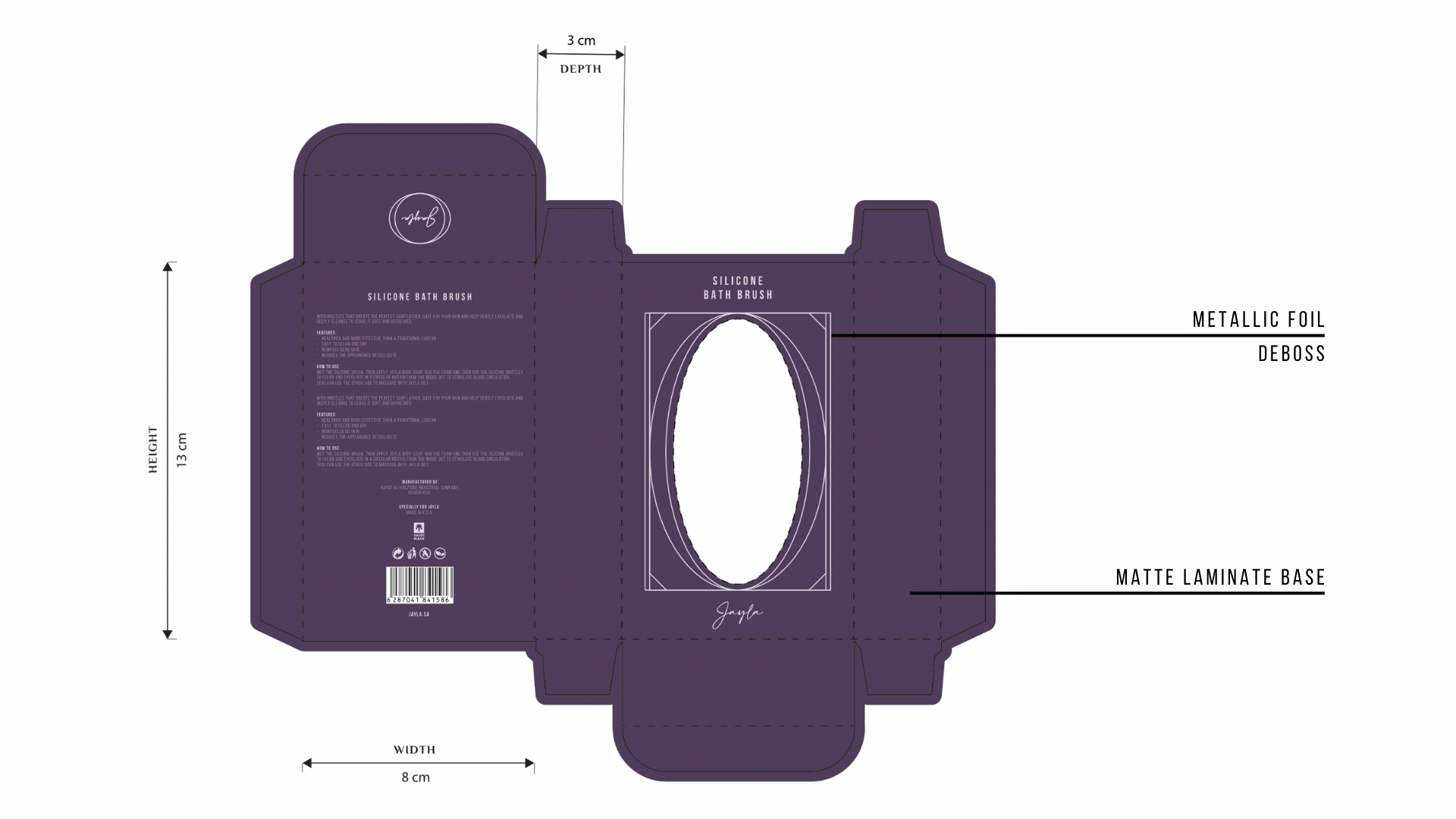
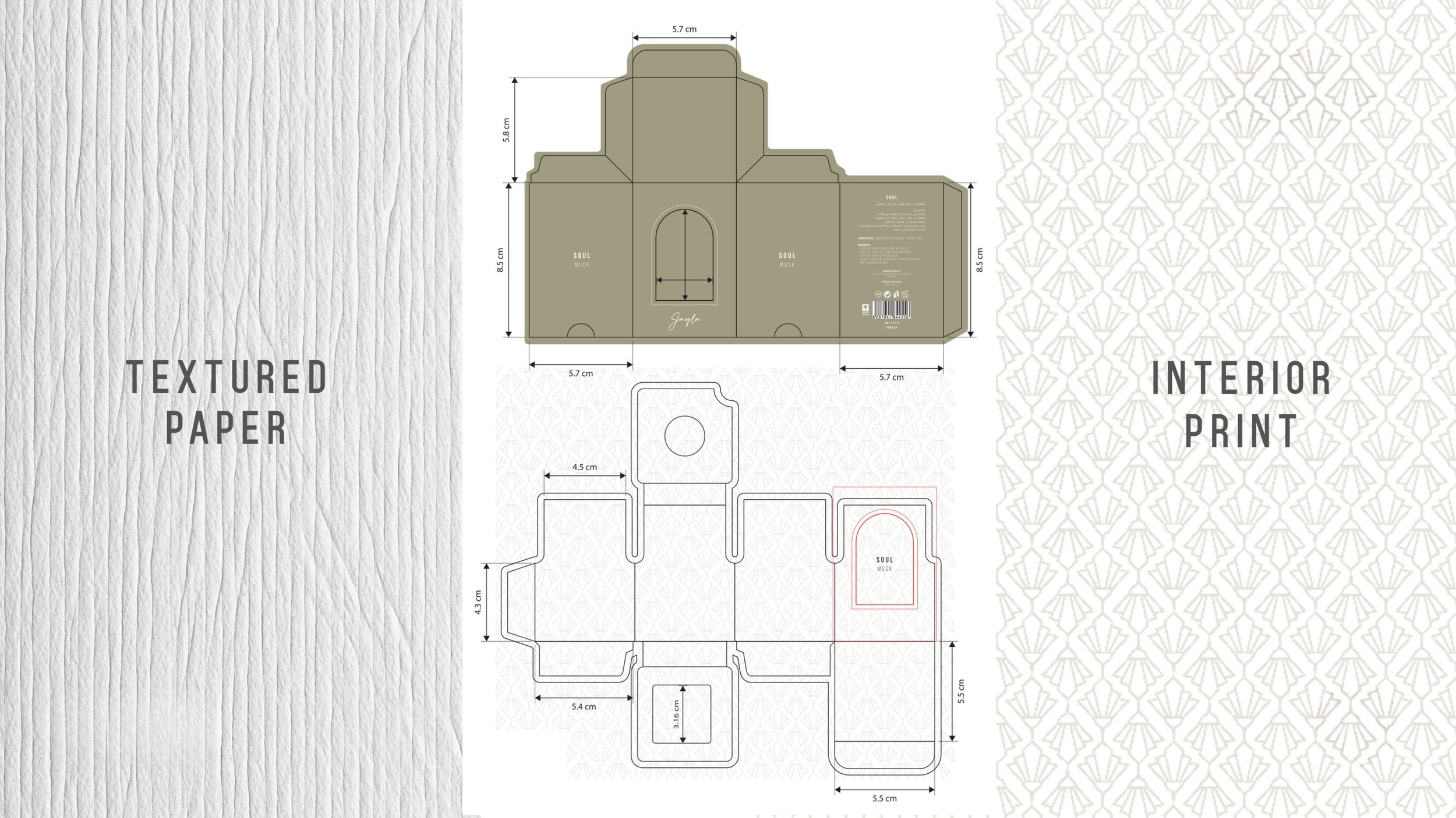
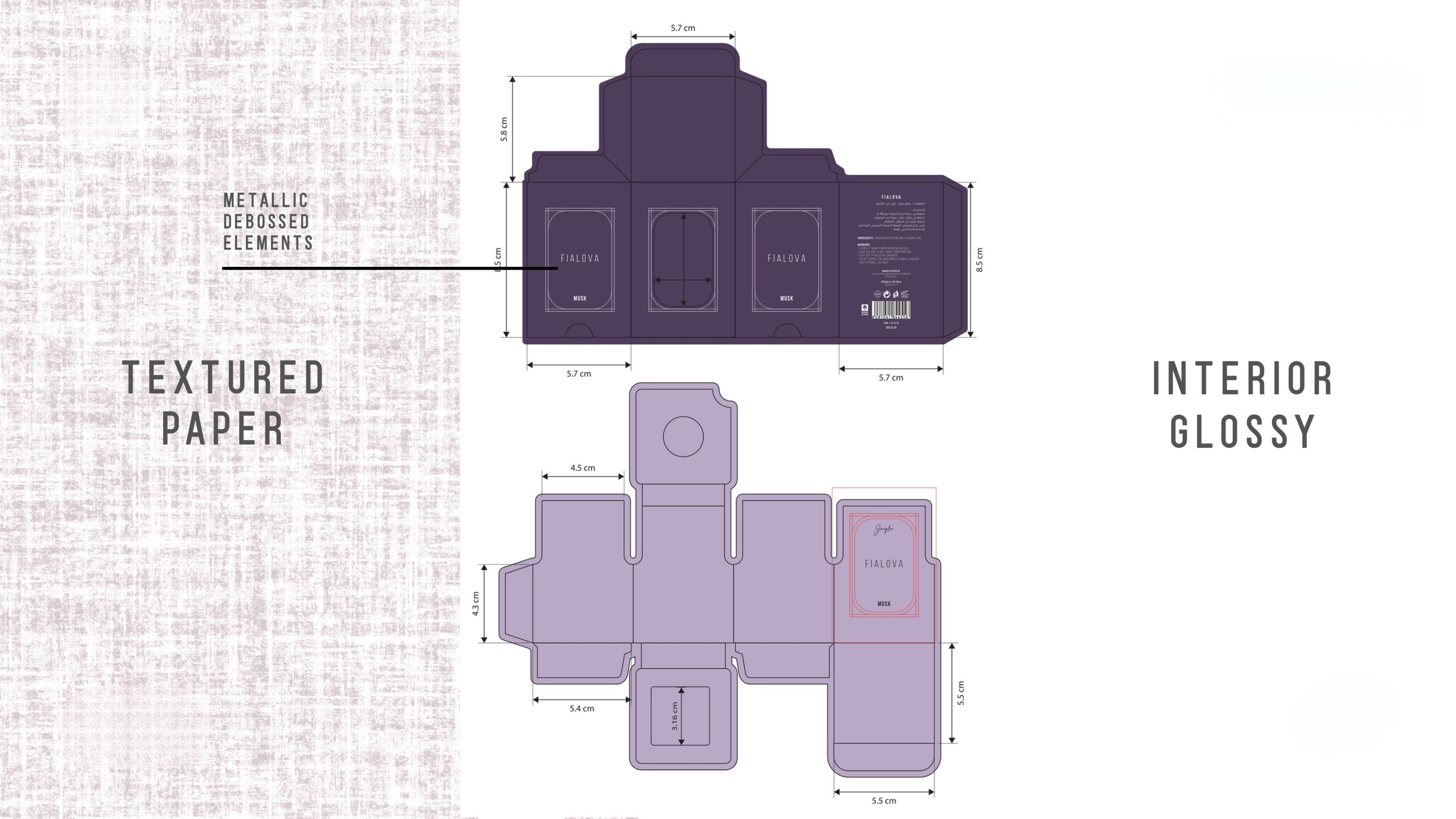
production & technical design
Working directly with manufacturer templates, I translated the new designs into production-ready artwork; accounting for material choices, debossing, embossing, spot UV, and specialty finishes.
Typography alternatives were also explored to align with the new direction, giving the client flexibility to choose what best suited the brand’s future vision.
Each file was prepared to ensure design integrity from concept to physical product, bridging the gap between creative vision and manufacturing reality.
outcome
The rebrand defines a clear and confident identity for Jayla, positioning the brand strongly within the luxury skincare and fragrance market.
With a cohesive visual system now in place, the new packaging elevates the entire product range while supporting global expansion and retail presence.
The focus throughout was on creating a product collective that feels cohesive, timeless, and premium across global audiences.